FundEx Website Redesign
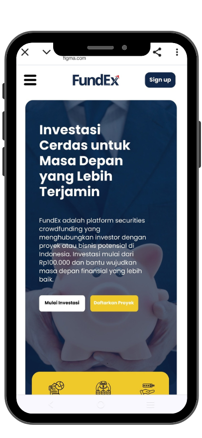
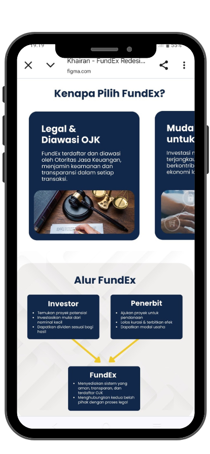
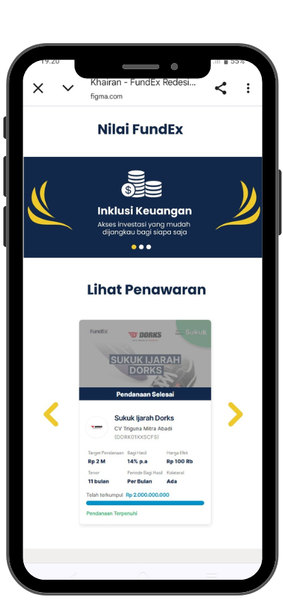
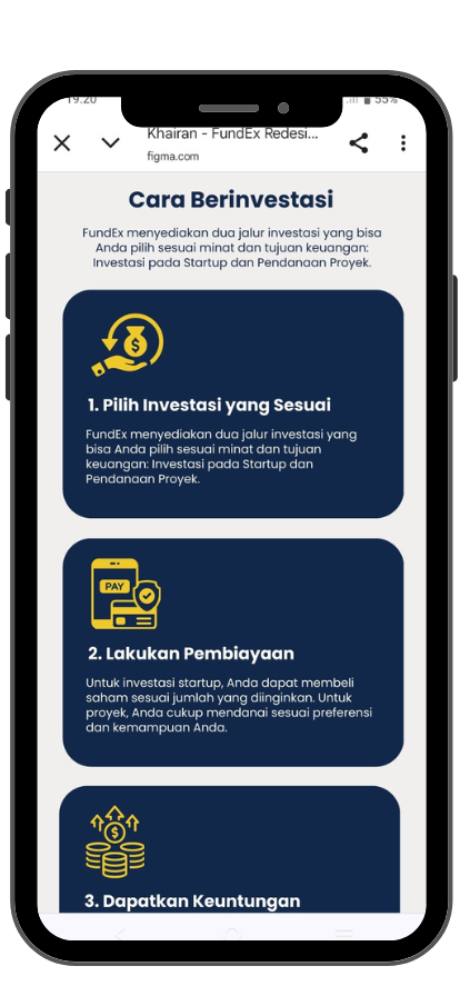
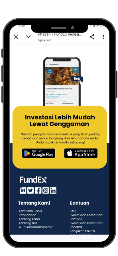
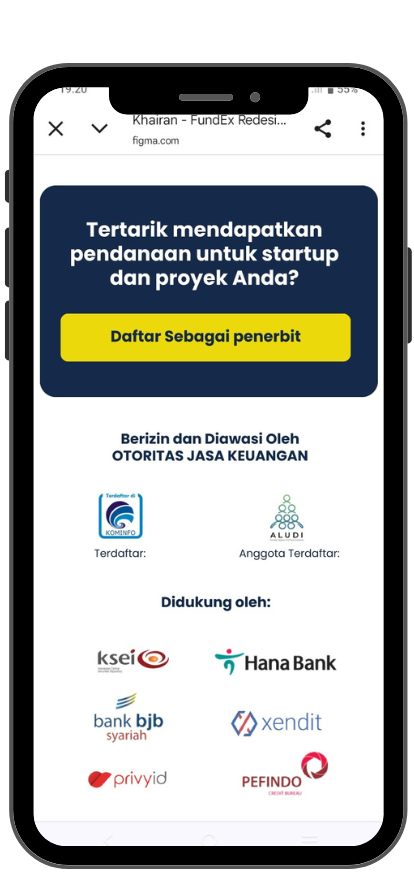
This redesign project was completed as part of my final task during the Project-Based Internship with FundEx and Rakamin Academy. Originally a casual assignment, the project evolved into an opportunity to explore product design in a more meaningful way. I focused on elevating the overall user interface while ensuring the experience became more intuitive, accessible, and engaging — particularly for first-time investors and project owners. The improved version strengthens FundEx’s core message, clarifies user actions through improved call-to-actions, and introduces a more structured, clean layout for better navigation and trust-building.
🧩 Topic Area
🔗Link
🛠️ Skills Used
⭐ Key Improvements
Clearer Navigation: Streamlined structure helps users understand what FundEx offers, faster.
Stronger CTA Placement: Key actions like “Invest Now” and “Start a Project” are more visible and better positioned.
Visual Hierarchy: Improved layout, spacing, and typography guide user attention effectively.
Modernized Look & Feel: A cleaner, fresher interface that better communicates credibility and professionalism.
